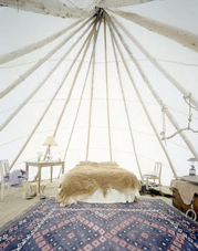
Most people would say that children's rooms should be bright and colorful. I agree from a health standpoint- it's good for development, mental health, etc. But I tend to sway more towards neutrals and texture for children's rooms. I actually tend to sway more towards neutrals and texture in everything, now that I think about it. Kate Young and Keith Abrahamsson's son's room featured here on the Selby is the perfect example. It's not boring or "unhealthy" looking. It's the perfect mix of a sweet, curious, and wholesome.
3.24.2010
Subscribe to:
Post Comments (Atom)


5 comments:
I like it too. It feels like its very cozy in there.
Great blog, thanks for the comment. New follower. (:
This is more classy and so fresh to look at... not the usual colorful kids' rooms we see.
Have a great day! xoxo
How sweet! I am partial to a neutral base with pops of colours to liven things up, but I really like this. I think the "goldfish bowl" on the wall in the last shot is what got me. It's quite fun & whimsical, and definitely unexpected.
i like it neutral too. that's more or less what i did with my son's nursery. i had one very colorfoul duck oil painting, but everything else was a soft green shade. Once the colourful toys started adding up, they kinda complemented the oil painting. :)
C'est ravissant
Post a Comment